Patient Payments
Viewing the costs of medical services can bring about emotional distress. Oftentimes our patients not only experience chronic physical pain but also feel that they might be unable to pay for their surgeries and health services in one installment. Patient Payments aims to provide an experience that is empathetic to where patients are financially and allows patients to be in control throughout an episode of care.
WHAT'D I DO?
Research, interaction design, visual design, prototyping and testing, design QA for engineering.
WHEN WAS THIS?
Mar 2020 - Jan 2021
WHAT'D I WORK IN?
Figma, Miro, Confluence, Notion, Sketch, Adobe Suite (PS, AI, AE), Lucidchart
WHO'D I WORK WITH?
2 other product designers, 1 product designer lead, 1 UX researcher, 1 visual designer, 1 product manager, 1 technical program manager, a team of engineers, 1 content strategist
As the lead product designer on the product, I contributed to the product roadmap as well as the strategic vision. I was responsible for conducting secondary and evaluative research, designing and testing the features through design pairing, and incorporating the new design system and company brand.
I worked on this project during my time at Lumedic, a patient-centered Health Information Logistics company that optimizes the way people access, manage, and pay for healthcare.
Foundational Research
What do we build first?
How do we know what we build would solve the problems that patients are facing? As the product is being designed and developed, it is important to ground decisions and perspectives based on foundational research that informs the context and situational aspects of patient payments.
Methodology
- Literature Review
- Product Comparison
- Patient Interviews
From Research to Design
- Design Principles and Findings
Toolbox
Toolbox
- Patient Journey Map
- Patient Personas and Segments
- Aligning with the Product Team
Literature Review
We found themes that paved the way for designing and developing a solution for all patients.
After analyzing industry trends, patient attitudes and behaviors, as well as provider solutions related to patient payments, four themes emerged:
- Trends such as the rising demand for retail-like technology
solutions and practices, as well as the growing patient
financial obligation due to high deductible health plans, are
changing provider payment services and patient
expectations. - For providers, how patients pay for care is part of a larger
comprehensive strategy for patient engagement that should
seek to be patient-centric. - Having one place online that is personalized for the clinical
and financial tasks patients need to accomplish can help
increase patient satisfaction and patient health outcomes. - Offering more payment options to patients could increase
the likelihood that they will pay their bills.
From Literature to Design Principles:
Design language: Tone of our service should be empathetic, informative, and friendly.
Core features: Pre-service cost estimates, cost transparency, and convenient payment options are core aspects of a modern healthcare that patients value as consumers, and let them make educated decisions about
their care
Personalization: Our platform should be intelligent and personalized to fit the unique goals and needs of patients i.e. track specific interactions & preferences, and provide recommendations, i.e. comprehensive help and support, customizable payment plans, seamless refunds, etc.
Product Comparison
Understanding the methods our competitors employ to solve similar problems has helped me develop creative solutions.
I partnered with our UX researcher to examine dimensions relevant to payment platforms such as collection method, security & compliance, payment flexibility, integration, propensity to pay, etc.
Based on our learnings, we consolidated a few strategies on collection methods, mobile use, payment options and methods, estimate, and communication. For example, we learned that out of 9 products, 1/3 offer financing solutions. This means that we want to offer payment plans so patients have more flexibility.
Insights from Patient Interviews
Both patients' physical and financial health influence their payment
considerations.
We wanted to learn about...
- Patients' decision-making process related to their healthcare financial experience, particularly during the pre-service timeframe
- Patients' digital behaviors when paying for their healthcare
And validate...
- Patient Journey map
- Product roadmap and feature list
After 6 rounds of user interviews, we learned about what mattered to patients' healthcare financial experience and created the following design principles and patient scenarios that helped us envision features that would be the most helpful.
Design Principles: Empathy and Control, Financial Transparency, Managing Finances, Flexibility, Personalization, Notifications, Support, Patient Portal Integration, Disclaimers, Clear CTAs, Informational FRE, Finance Assistance
For example, for Financial Transparency:
Costs of services and coverages can be confusing when patients are trying to figure out a plan for their care. Tina is preparing for the costs of an upcoming care, but she does not know what her financial responsibilities are, and it usually takes calling someone to find out. How might we allow Tina to better understand what her options are?
User Scenario: Tina wants to know what her costs are on-demand, without having to wait and be put on hold over the phone.
Categorized Feature: Estimates
Aligning with the Product Team
Patients have different goals and needs. What can we build knowing our scope and constraints?
The questions we are investigating at this stage involved understanding the overarching business objectives and desired outcomes. Through a series of exercises with the stakeholders, we learned about the nuances in the pre-service context and formed provisional product strategies.
Q: How might we encourage the shift in patients’ mental model so that they’d want to pay for care prior to service?
A: The focus of design should be around financial planning: estimates, early pay discounts, payment plan.
Q: How might we adequately explain core concepts like “estimates” and “early pay discounts” to the patients?
A: We should offer clear explanations through disclaimers and alerts throughout different touchpoints in a patient’s experience.
Q: In addition to offering early pay discount, how might we assist underprivileged patients further?
A: We will make the financial assistance section in the support center easily discoverable.
Designing
We hit a few roadblocks, and it was a struggle. We challenged our assumptions, made tough decisions together, iterated tirelessly... and shipped
Roadmap & Strategy
- Break it down to break through
- Design pairing
Main Features
- Some of the Core Features
- Design Patterns
Roadmap & Strategy
Break it down to break through.
After prioritizing features based on research findings, we thought that designing the dashboard first would be the logical approach. However, we took a different strategy.
It was challenging to start with the most complicated piece (i.e. the dashboard) during such a large-scale and complex project. Instead, we focused on clearly defining specific feature requirements and user flows. Starting with the smallest part gave us more clarity as we considered how to best synthesize them all together into zero states.
Design Pairing:
Overseeing the strategic vision of the product, I collaborated closely with our UX researchers and two other designers. We had to get creative about our design process as we worked remotely in 2020 and needed constant collaboration throughout this project. We experimented with design pairing which propelled the design forward significantly.
Design pairing is based on pair programming where we would design all the core features together and get feedback in real time. This meant that we were in a call jamming with each other throughout the day, playing either as the generator or the synthesizer.
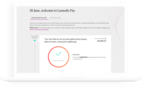
From the Dashboard to One-time Payment: designing for a connected experience
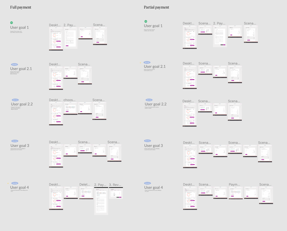
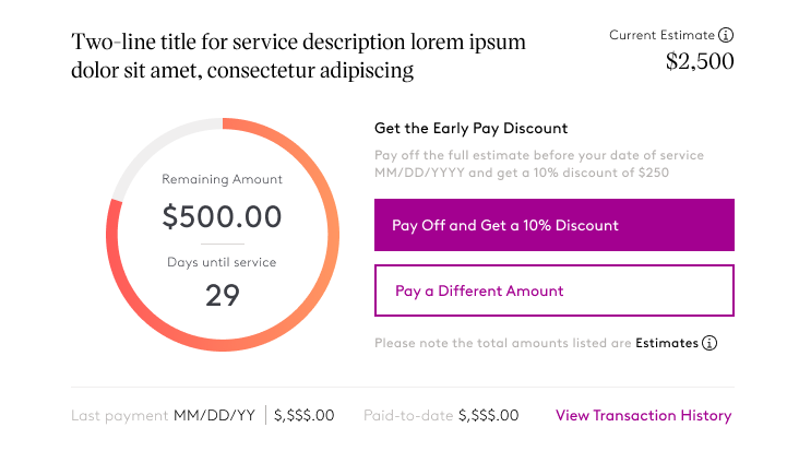
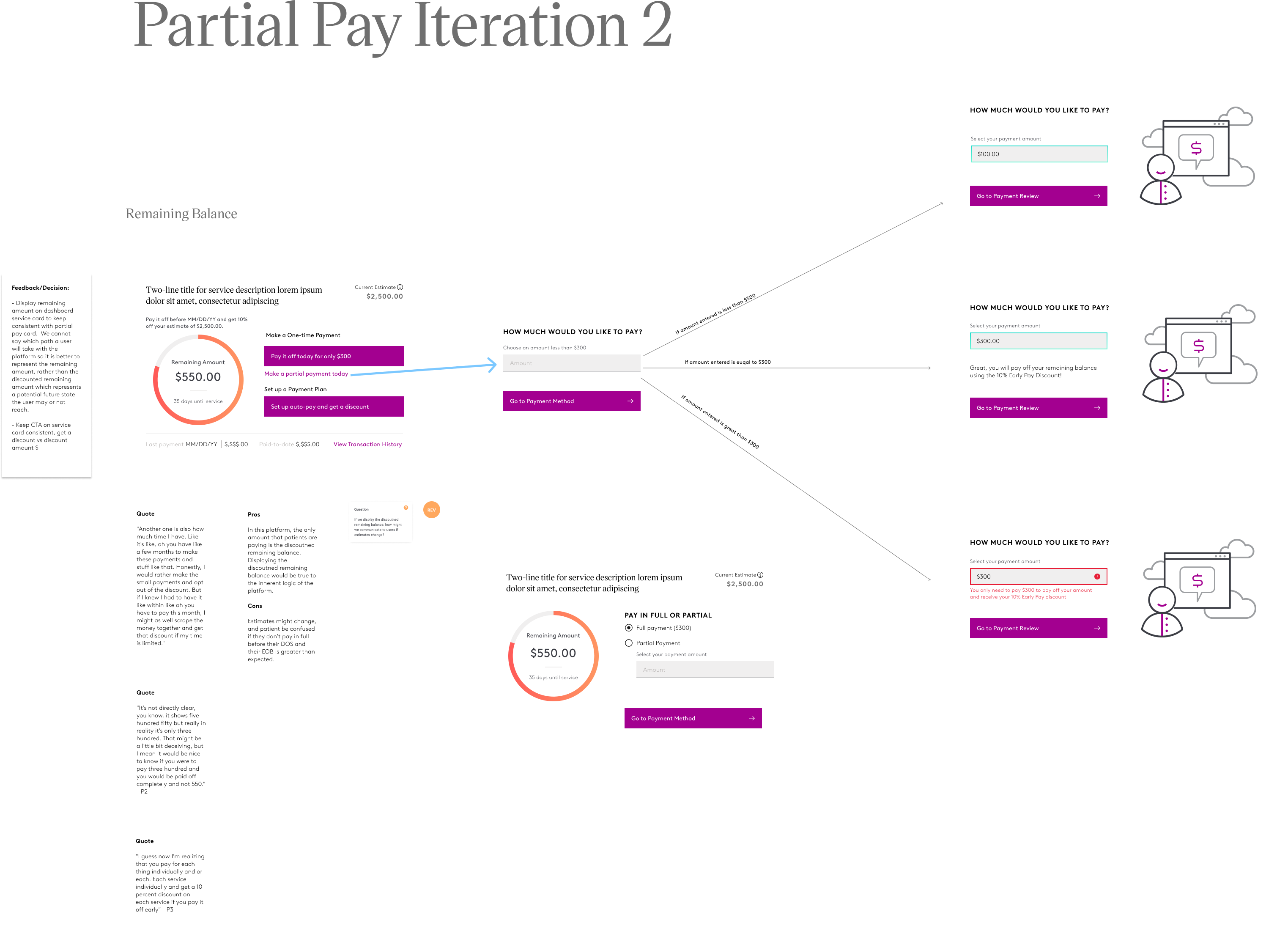
Once patients have made a decision about whether they want to make a full payment or a partial payment on the dashboard, they can focus on completing the task in the payment flow.
Designing for the experience of viewing the price of a service is more than just displaying the numbers. It was all about considering the context of our patients and communicating information in a thoughtful and accurate manner.
How might we communicate important concepts in the pre-service setting like estimates and discounts? We thought a lot about the interaction framework and how everything worked together.
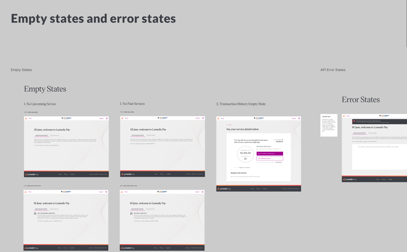
Always on the lookout for both common use cases & edge cases, empty states & error states
We worked closely with research and engineering to design for different scenarios.
"But at a glance, it wsn't immediately clear to me what the numbers represented."
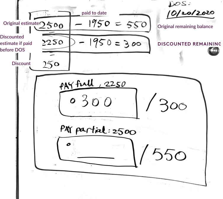
We aimed to provide contextual information to help patients make sense of what they’re paying towards in the pre-service setting. However, through team reviews and an initial round of usability study, we learned that for patients there is a disconnect between seeing the original service estimate on the dashboard card but then paying a smaller amount (discounted estimate) in the payment flow.
✉︎ Challenge No.1
HMW provide sufficient contextual information so that patients could differentiate between the original estimate and the discounted estimate?
✉︎ Challenge No. 2
HMW inform patients that getting a discount is contingent on the timing of their complete payment. They would be receiving a discount today if they paid off their balance, and they would be paying towards the original estimate if they did not complete the payment before their date of service?
✉︎ Challenge No. 3
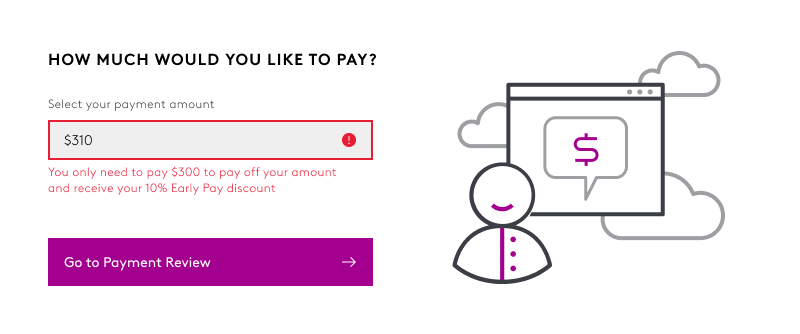
If the amount that patients enter is greater than the discounted remaining amount, we should explain to the users that they only need to pay a certain amount to receive a discount.
Payment Plan
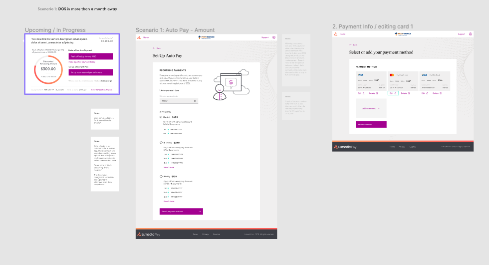
Payment Plan allows more flexibility for patients to make payments and receive an early pay discount.
The pre-service context of the product added more complexity to the creation of a payment plan: it was crucial to communicate to patients that payment plans only extend to patients’ date of service. After an episode of care, a patient may set up new payment plans in the post-service setting to pay the remaining balance.
Installment or Frequency?
We explored different ways a patient can set up a payment plan:
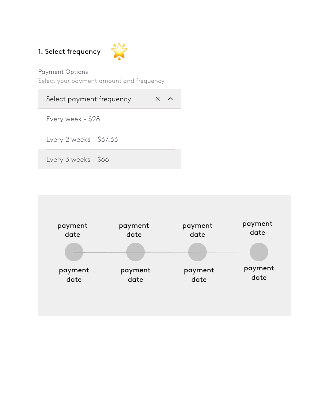
Payment frequency
After a few discussions with the team, we decided that payment frequency would provide more clarity on the payment date and mitigate the context switch between the pre-service setting and the post-service setting.
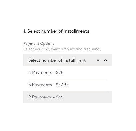
Number of installments
Setting up a payment plan by installments makes the date and frequency of payment unclear.
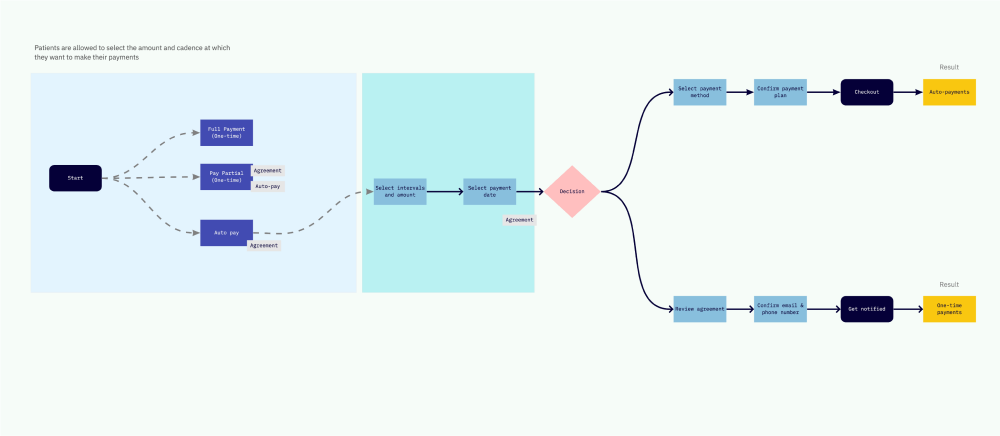
Wait but there's more... patients can also set up a payment agreement without committing to it.
As a requirement from the stakeholders, patients would be able to set up an agreement as a financial planning tool. Do we introduce the options to set up an agreement or a payment plan on the dashboard card, where things are getting crowded? We explored different ways to surface the features: the payment plan should always be discoverable on the dashboard card, whereas an agreement can be embedded in the payment flow.
Design System and Design Patterns
Consistency in design language is key.
We refined the Carbon Design system and applied Lumedic’s brand to reusable components.
Guided by clear standards, we paid close attention to the style, the UX content strategy, spacing, and component states.
We created a Lumedic Design Patterns book so that other products can remain consistent in terms of spacing and styling elements.

Evaluative Research
We created a measurement plan, implemented tools, conducted studies, and analyzed findings.
Dashboard Feedback Study
- Research Method
- Research Questions
- Scenarios
- Results
Usability Study Round One & Two
- Research Method
- Scenarios
- Results
Dashboard Feedback Study
Although the site is visually appealing, information about discounts should be brought forward.
Research Method
Used UsabilityHub to conduct survey that gathered quick feedback on the design of the Lumedic Pay dashboard.
Presented screens of dashboard that included discount and estimates features.
n=10; participants were recruited through Respondent and indicated that they have paid for their healthcare bills online in the past.
Research Questions
Is the amount of information / numbers too much?
How do users interpret the data in the progress bar?
How do users interpret the numbers at the bottom of the card?
Is the copy helpful in describing how users can manage their payments?
Scenario
Imagine your doctor's office told you that you could pay in advance for an upcoming appointment. They send you a link to a website and you login.
Results
Attractive and clean at-a-glance
On average, participants chose positive responses 75% of the time when selecting words that described the visual aspects of the dashboard, with the words “attractive” and “clean” chosen most frequently.
Recommendation: Continue to use design elements that balance brand, simplicity and delight.
Show me how much I can save
The three MOST helpful elements of the service card that help users make decisions about payments are the discount, the remaining amount, and the days until service.
Recommendation: Bring forward the discount with the remaining amount and time left, since users are more than likely at the site to save money.
Usability Study Round One
Validating our designs and flows...
Research Method
Conducted 60 min. moderated sessions via Microsoft Teams led by UX Researcher.
n=5; participants were patients who have paid for a healthcare bill online within the last 6 months
Used clickable prototypes for two tasks: Registration & One-time payment.
Research Questions
Registration:
- Do users understand how to set up an account?
- Can users navigate the registration flow without distress or confusion
- Do users understand why they are providing personal information?
- How do you feel about the amount of information you were asked to provide?
One-time payment:
- How difficult do users perceive submitting healthcare payments to be?
- Are users able to print a copy of their transaction receipt?
- Does the ‘Download’ CTA make sense to users if they are looking to print a physical copy of their receipt?
Key Insights
Managing estimates, bills, and payments
“I know I have a deductible, but they [can] calculate it and they can explain it to me a million times, I just never know. It's always a surprise and it's very frustrating and I kind of have anxiety.” – Participant 4
Managing estimates, bills, and payments can bring about emotional distress. Whether receiving an estimate before service, or a bill after service, users want transparency and no surprises, so that they can choose the best strategy for payment.
Informative and intuitive copy
“I love it when a website is a bit of a psychic, but not in the spyware way.” – Participant3
Users would like copy to be clear and forthcoming, especially when it comes to data privacy and security. They also expect to see confirmations of successful completion of tasks, as well as guidance on next steps they can take.
Privacy vs. speed
There is a balance between these concepts that are at times complimentary and sometimes oppose each other. It is important to offer users flexibility to fit their needs.
Deployed
Patient Payments has received both positive and negative feedback since our initial release. Now is the time for ongoing improvements.
Shipping
- Design QA for Engineering
- Incremental Feature Improvements
- 3 Things I Learned
Design QA for engineering
It was exciting to see our hard work turn into code.
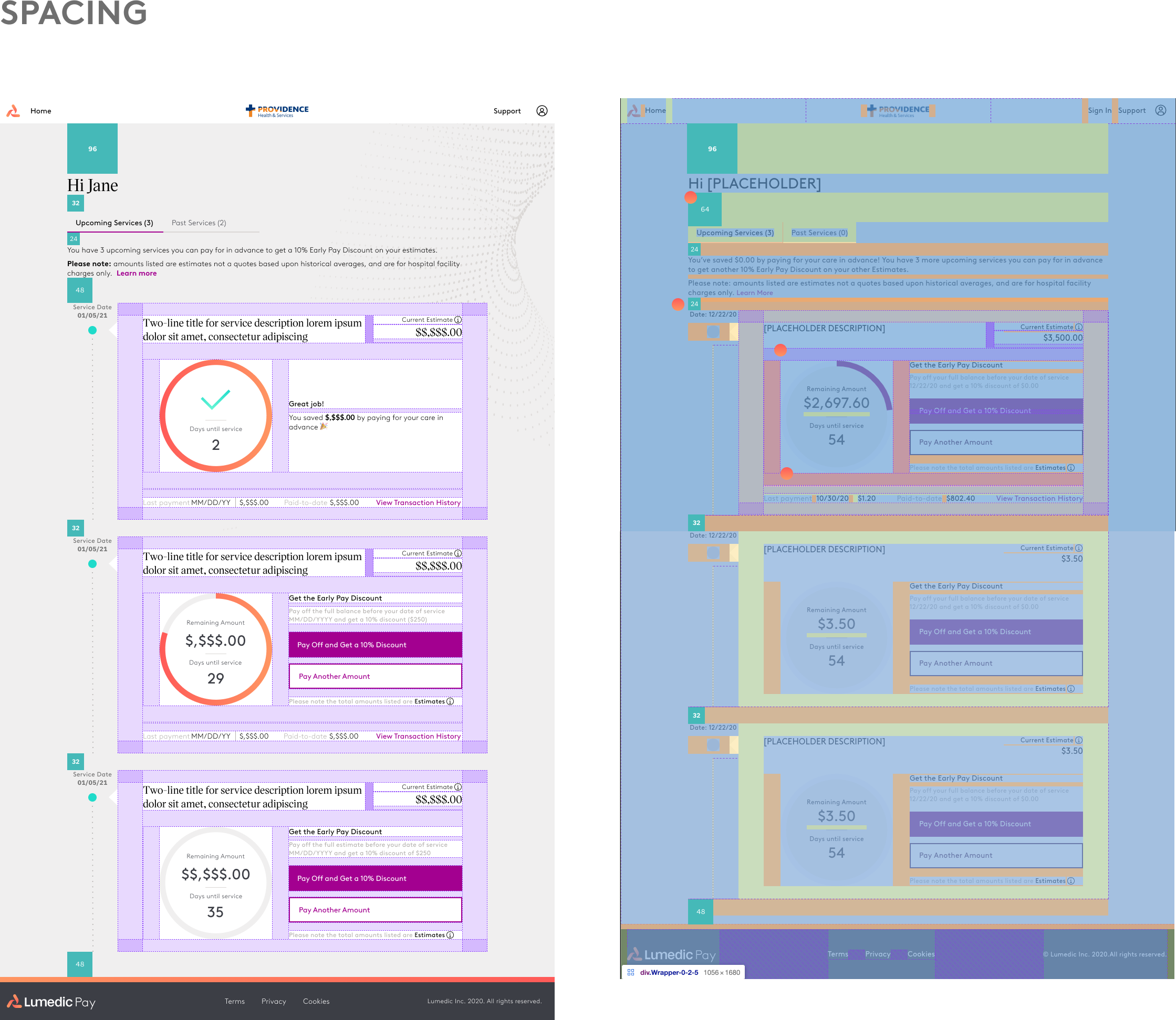
In order to make sure that the product is successfully deployed, I worked closely with the QA team to encourage alignment of designs with implementation.
Feature Improvements
Going back to the drawing board after research learnings.
From reassessing and understanding the patients' decision-making process to finetuning and making minor adjustments so that some features are more accessible and discoverable, we worked on iterations big and small.
3 Things I Learned
While growing with the project, I learned...
- Context matters. We are not just designing for the digital experience. Our design has an impact on the patient's financial journey in healthcare, and pixels have ramifications in the real world. The pixels are tools to instigate the experience of paying for health services, but they are only a small part of the experience of patients taking control of their health.
- The whole is greater than the sum of its parts, but the devil is in the details. We thought a lot about the product's system models, our conceptual models, and the patients' mental models. At the same time, we needed to balance that with great intentionality behind each number, each CTA, each perfect alignment down to the pixel.
- Collaboration cultivates creativity. Through constant design pairing, I learned to become more aware of the why and pushed myself to clearly articulate every design decision. I learned to better understand each stakeholder in a meeting, see their perspective, and synthesize the feedback.
Thanks for reading!