
Polaris
I was tasked to design Polaris, an incredibly complex financial data system, from discovery to delivery. Polaris is a trade promotion optimization tool that leverages existing data from Compass (the parent trade promotion management tool) to further calculate a key account manager’s promotion data in order to optimize new promotions. It allows key account managers to set their spend and time parameters and uses an IBM machine learning model to enable sales forecasting.
My roles
I designed KraftHeinz’s internal applications Polaris (supported by an artificial intelligence IBM API) and Compass (an Enterprise Promotional Data Planning platform). For this case study, I will focus on Polaris.
Customer Insights & Ideation
- Creating style guides based on branding research
- User story definition and requirement grooming
- Created user flows, wireflows and user journeys
UX Strategy
- To translate business requirements into visual solutions by creating user-centric designs
- Helped team identify KPIs to be measured for success, and use UX to achieve them
Agile Development
- Daily meetings with KraftHeinz stakeholders to groom the requirements, uncover insights and translate concepts into features
- Backlog prioritization
- I advocated for the importance of user research and user testing
Collaboration
- Defining the product with stakeholders and program manager
- Working with program manager, front end developers, software engineers in the agile process
- Assist in Functional Design
Validation
- Conducting unmoderated usability tests to gather user feedback and response to the content of the website
- QA & UAT testing to ensure the website is fully responsive
My roles
Customer Insights & Ideation
- Creating style guides based on branding research
- User story definition and requirement grooming
- Created user flows, wireflows and user journeys
Agile Development
- Daily meetings with KraftHeinz stakeholders to groom the requirements, uncover insights and translate concepts into features
- Backlog prioritization
- I advocated for the importance of user research and user testing
Collaboration
- Defining the product with stakeholders and program manager
- Working with program manager, front end developers, software engineers in the agile process
- Assist in Functional Design
Validation
- Conducting unmoderated usability tests to gather user feedback and response to the content of the website
- QA & UAT testing to ensure the website is fully responsive
My roles
I designed KraftHeinz’s internal applications Polaris (supported by an artificial intelligence IBM API) and Compass (an Enterprise Promotional Data Planning platform). For this case study, I will focus on Polaris.
Customer Insights & Ideation
- Creating style guides based on branding research
- User story definition and requirement grooming
- Created user flows, wireflows and user journeys
UX Strategy
- To translate business requirements into visual solutions by creating user-centric designs
- Helped team identify KPIs to be measured for success, and use UX to achieve them
Agile Development
- Daily meetings with KraftHeinz stakeholders to groom the requirements, uncover insights and translate concepts into features
- Backlog prioritization
- I advocated for the importance of user research and user testing
Collaboration
- Defining the product with stakeholders and program manager
- Working with program manager, front end developers, software engineers in the agile process
- Assist in Functional Design
Validation
- Conducting unmoderated usability tests to gather user feedback and response to the content of the website
- QA & UAT testing to ensure the website is fully responsive
Challenge
When it comes to data visualization, users seem to share a common goal. As the Global VP Design at IBM articualted, "(the users) have data, they have questions, and they need an analytics tools that will help them make sense of their data and turn it into useful business insights, while reducing uncertainty." How might the design reduce redundancy, enables real time interation with data, and assist users in the data analysis process?
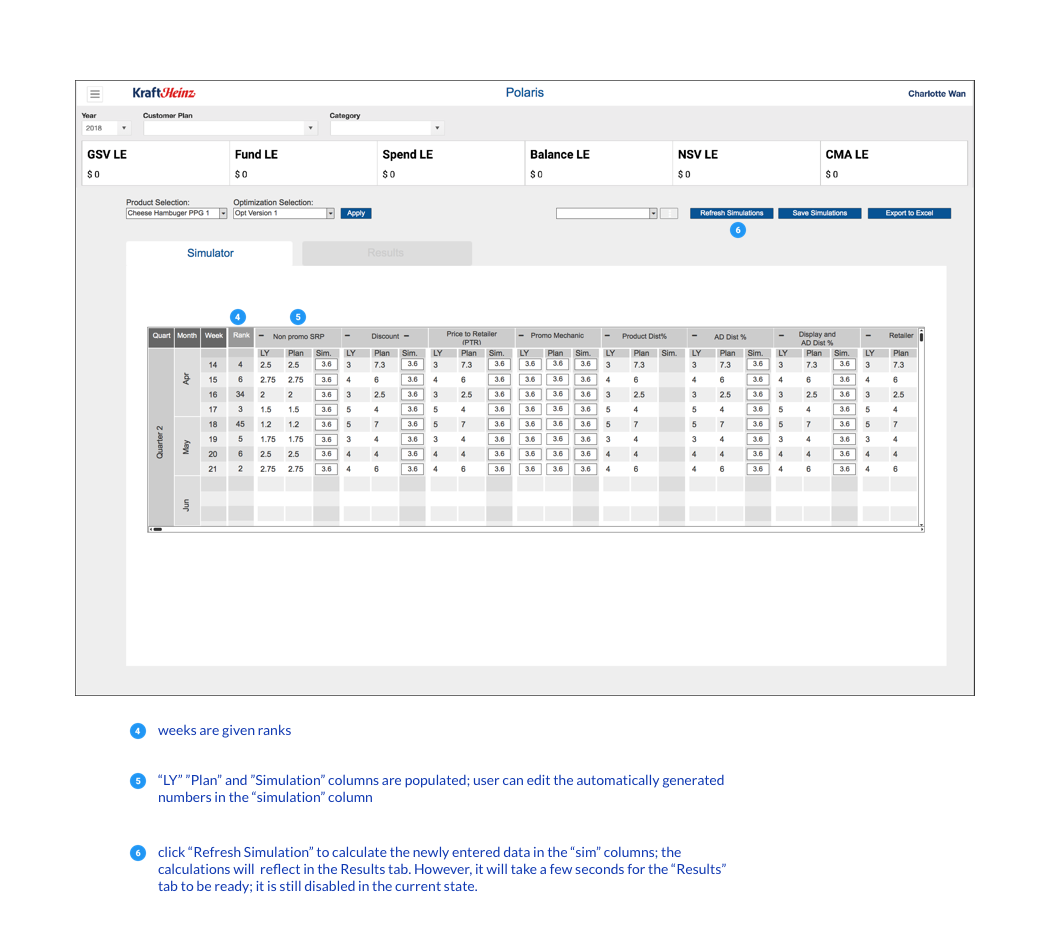
Thoughts...
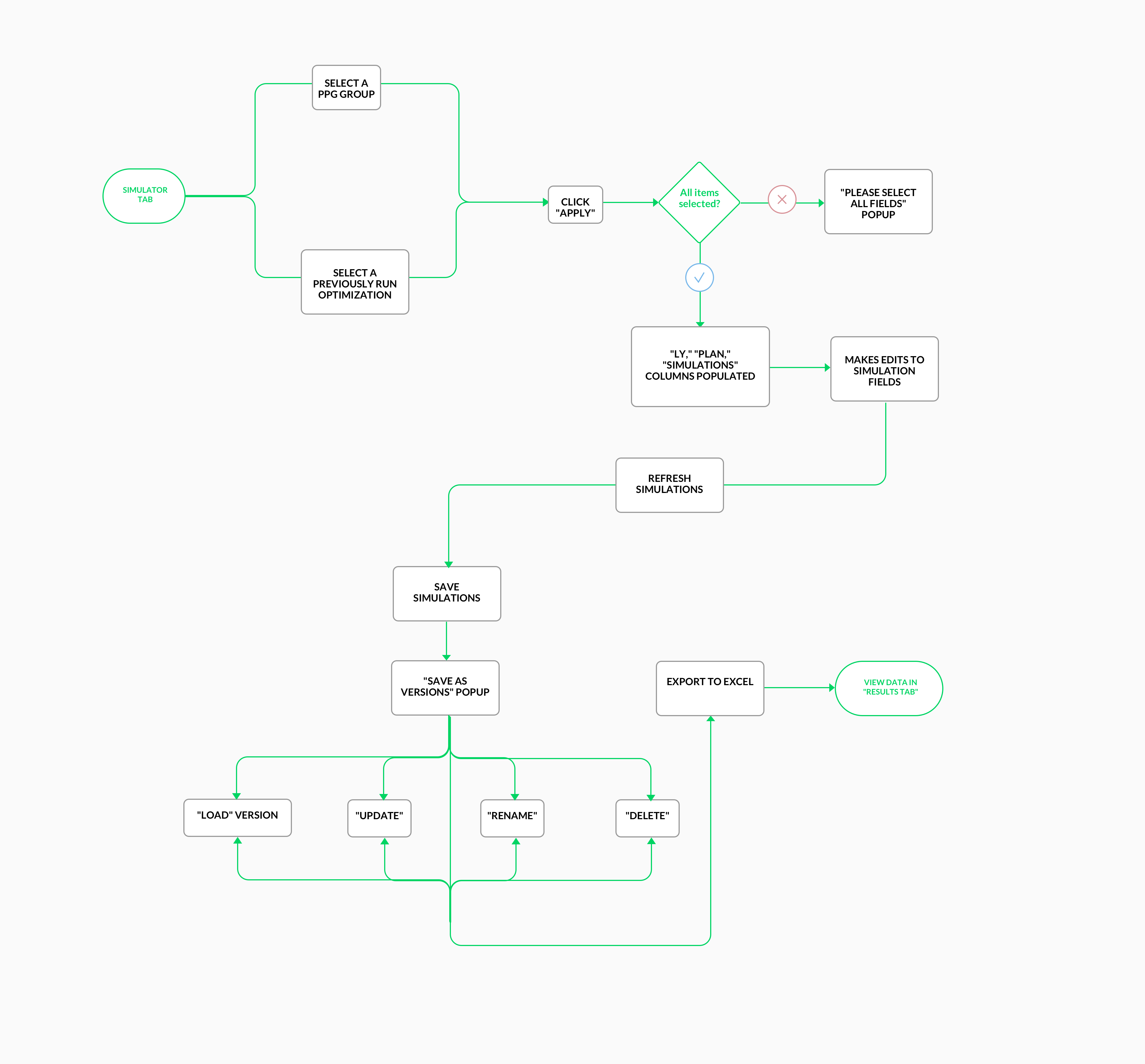
After shipping lo & hi wireframes and annotated wireflows, we are currently involved in an iterative process working with the program manager and front end developers to test this product and conduct further user research. We hope to sit with key account managers soon to hold conduct inquiries and learn more about how they interact with the application.